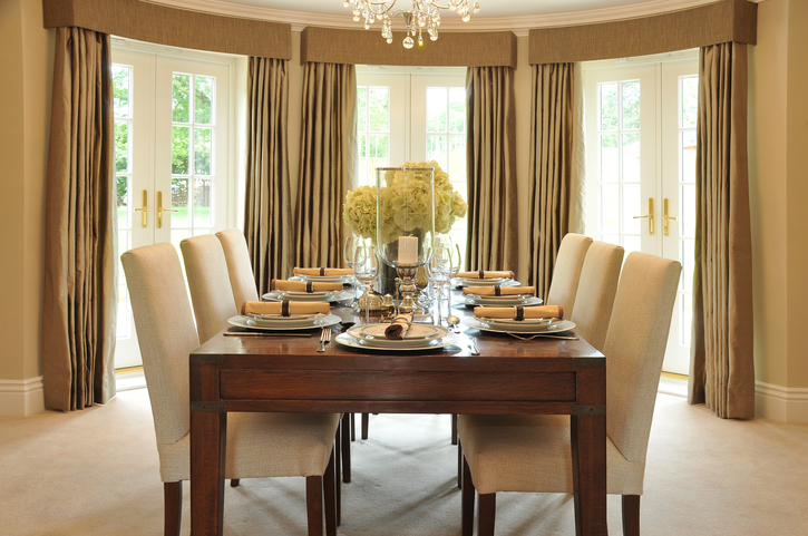
Work with Carole Lee and Avoid Costly Mistakes
Unfortunately, some people may become intimidated by the idea of hiring a professional interior designer who provides both interior design and renovations services. Perhaps you are concerned about the process of working with an interior design team, as well the potential costs associated with hiring a professional.
Carole Lee understands your fears and does her best to alleviate your concerns by providing easy access to each client and by offering a full suite of interior design and complete renovations services. And, it’s important to remember that as a professional interior designer she is a trained expert and can know what is best for your project. It is smart to trust the professionals to do what we only think we can do. Here are five reasons why you should hire a full- service interior designer.
Avoid Costly Mistakes
The number one reason to hire a professional interior designer, like Carole Lee, is to avoid costly mistakes. Have you ever bought a piece of furniture that looked amazing in the store only to discover it was too big once you got home? Or, have you ever painted a room three or four times trying your best to get the perfect color, only to fail? Do you really understand all of the requirements and have the skills required to renovate your kitchen or bath? Mistakes can be real budget busters. Although it may seem like you may save money on DIY projects as opposed to paying an additional designers’ fee, the truth is that hiring a designer can help you avoid costly mistakes and help you make decisions that will increase the value of your home. And Carole Lee will get the best value out of what you can spend. She is accustomed to working with a line item budget and will manage your project and understand where every penny is going.
Save Time
Let’s face it. Redecorating and renovating space requires a lot of work and a lot of time. Extensive background work must initially be completed with regards to the structure and location of the space, the different styles available and many minor details as well as serving as the liaison with many skilled tradespeople. Carole Lee Interiors will handle all of the details and make recommendations based on your specific dreams and goals. As a full-service interior design and build firm, she provides turnkey solutions offering both interior design and renovations services. As one project manager handling your entire project, she really saves you time.
Better Resources & Contacts
Carole Lee has curated a list of the best and most trusted resources and contacts for small, medium and major interior design projects. With advanced knowledge of construction practices for large scale projects and a network of plumbers, masons, carpenters and electricians she stands by the quality of work her team provides and knows it will be up to your standards.
A Complete Visual Story
As an ASID certified interior designer, Carole Lee has spent years training and working in her field. While working with you to decide on your décor style and goals, she presents a whole visual story, so you understand the projected outcome of your space before starting the work. This provides a clear timeline of what to expect from start to finish. Without a designer providing direction your end result may not be what you expected or wanted.
A Trained Eye
Carole Lee is a trained designer so you get an immediate plan of action for your space with a pair of eyes that will catch things you are guaranteed to miss. She has spent years perfecting her craft and is trained to look at a space creatively, spatially and practically, paying attention to every detail; from the placement of furniture and lighting, to color palettes, traffic flow as well as what part of the room should be the focus to create the added WOW factor.
Contact Carole Lee today and let your dream space become a reality.
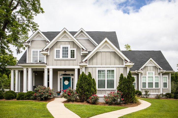
Give Your Home Curb Appeal
With many people spending more time at home due to COVID-19, homeowners are taking a closer than usual look at their surroundings, both inside and out. Now with the summer months upon us, we are enjoying more time outside and maybe crave a few updates and changes. During stressful times beautiful outdoor surroundings can bring solace to you and your family.
But if you intend to put your home on the market the main draw to buyers when first laying eyes on your soon-to-be-sold home is “curb appeal” or how it looks from the street. If you can draw potential owners in with the first glance, you are far more likely to get them in the front door and convert to a buyer. A professional interior designer can keep you from making costly mistakes and knows what trends buyers are looking for. As a single source interior design firm, Carole Lee Interiors provides both design services and complete renovations to provide you with turnkey solutions for your projects.
Here are a few things we are available to help you with to improve the curb appeal of your property. And, who knows, after you have completed all of these gorgeous upgrades you may want to keep your home after all.
- Landscaping: Trimming your shrubs so perspective buyers can see the house.
- Pressure washing: Clean your siding, driveways, walkways, patios and decks.
- Exterior Painting: Adding a fresh coat of paint to the front door or the entire house.
- Outdoor lighting: Installation of updated porch fixtures and walkway lighting.
- Outdoor Accessories: Order management of planters, porch and patio furniture
- Masonry: Redo walkways with flagstone, brick, concrete or hardscaping.
- Construction & Remodeling: Make your front porch larger or add a deck.
- Roofing: Cleaning or repair any problems with your roof.
We are now back open, fully operational and welcome the opportunity to give your home a refresh. Give us a call today. Happy summer!
Home as Your Sanctuary

With the country (and most of the world) finding themselves stuck indoors due to the escalating coronavirus crisis, many of us are having to adjust to working from home, working out at home and being limited with how many times we can leave the house.
First and foremost, our hearts go out to anyone who’s been impacted by the virus, either directly or indirectly. Our thoughts are especially with those who are sick, to whom we extend our heartfelt wishes for a full recovery. And we’re truly inspired by the selfless healthcare workers, first responders, grocery workers, truck drivers and the many others who are on the front lines working tirelessly to care for people in need.
Everyone needs to do their part. As an Interior design firm, we know that your environment can impact your well-being and productivity. And now that we’re all spending the foreseeable future at home, we thought we would put together a few ideas to help create your own home sanctuary and hope to make life just a tiny bit better.
• Bring in the natural world by adding planters & garden boxes for a calming vibe.
• Add colors that make you happy and feel serene.
• Bring a room to life with scents and flowers.
• Declutter your workspace and main living areas.
• Make your bedroom a cocoon.
• Create bath time bliss with fresh linens, a soaking tub and candles.
• Organize your kitchen with new kitchen storage solutions.
• Enjoy meals with family with farm-to-table accessories
• Recharge your patio with cozy chairs and colorful cushions.
• Add firepits for evening family gatherings.
Take care, stay well and let’s get through this together.
Sincerely,
Carole Lee
What is BESPOKE Interior Design?
The word bespoke has evolved from a verb meaning “to speak for something,” to its contemporary usage as an adjective that has changed from describing first tailor-made suits and shoes, and later, anything commissioned to a particular specification (altered or tailored to the customs, tastes, or usage of an individual purchaser), and finally to a general marketing and branding concept implying exclusivity and appealing to a high end luxury market.
For example, when it comes to furniture, bespoke furniture quit simply is custom- made furniture for your home, designed for exactly what you need, where you need it, what you need it for and exactly how you want it to look. Typically, a quality piece will be commissioned using the materials you want, based on your budget. When talking about kitchens, bespoke kitchens refer to a kitchen that is designed to order, unique in its specification and tailored to the exact requirements of its owner.
These same attributes can be applied to interior design. At Carole Lee Interiors we look at design as art, and believe exceptional interior design melds style with purpose, and is an aesthetic study in balancing crisp, clean design with the warmth of traditional architectural details. Every project we accept will be custom tailored to your space, your needs and your budget. Our goal is to enhance the way people use or live in their space and to create interiors that are truly unique. It is this versatility that is the key to our bespoke interior designs.
We invite you to contact us today to schedule a consultation.
How to Decorate with An Area Rug
Adding a modern area rug to a room that lacks excitement can solve your problem. While that alone is a good enough reason to decorate with a rug, there are many others good reasons as well. An area rug completes a room by tying together the different design pieces visually. A rug can also anchor a room, define it, add warmth, and help layer a room’s decor.
Here are a few ideas on how to decorate with area rugs:
Use Rugs to Define Areas
Use a rug to separate or define areas, such as seating or dining areas, and foyers. This is especially useful in apartments or larger rooms a that need a visually divider and definition.
Create Variety
You can use rugs to create variety within a space. When you use two area rugs in a room, be aware that sometimes rugs the same size can visually cut the room in two. Instead consider different sized area rugs to create visual divisions and variety.
Create Harmony
When using more than one rug, use area rugs that complement each other in both style and color palette. If not, you could end up with a jarring or unpleasant effect. Too many patterns not well managed in a room can create a disconnect and ruin the sense of decorative harmony.
Control the Volume
Area rugs can visually quieten a room or turn up the volume as needed. If your upholstery or wallpaper has an ornate pattern, choose a rug that is more subtle. When walls and upholstery are fairly subdued, you can try a busier pattern or bolder colors to add more interest to your room.
Create a Focal Point
Area rugs are great when used as a focal point and can make a huge impact. Create contrast by painting your walls a hue that echoes one of your rug’s accent colors.
Try Different Shapes
Not all area rugs need to be rectangular in shape. Let the way you group your furniture dictate the shape of your rug, then select either a square, round or oval shape to complement your furniture arrangement.
Update a Room
Area rugs can easily be changed out along with pillows and possibly window treatments, to update a room for changing seasons, or as a way to introduce new color trends.
TIP: As a safety measure and to preserve your area rug, always use a liner to keep your rug from slipping or creeping. The rug liner should be appropriate for your floor type, and also be the right size to fully keep the rug from sliding.
Be sure to contact Carole Lee Interiors and Complete renovations Service for all of your home design needs.
Excerpts taken from The Spruce.com https://www.thespruce.com/tips-for-decorating-with-rugs-1391114
Designing Your Outdoor Living Space
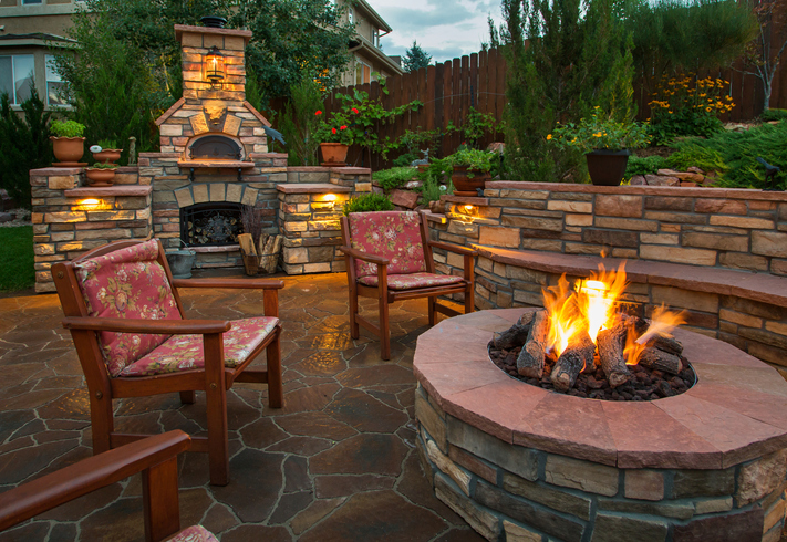
While the summer solstice is about June 21 in the northern hemisphere and considered the day that begins the actual start of summer, Memorial Day weekend absolutely kicks off the unofficial beginning of summer. With that, the outdoors becomes more like your living room and sometimes even your kitchen.
Carole Lee recommends starting with a clean slate by power-washing your home’s exterior top to bottom, including all porches and decks, gutters and window washing. Removing the winter’s grime gets you in the mood to begin to enjoy outdoor living.
Consider our team of general contractors to build a new customized patio or a beautiful walkway that coordinate with the look of your home and add new dimensions to your landscape design and curb appeal.
Outdoor cooking upgrades are a wonderful addition to any luxury living environment and a good investment to increase the value of your home. Outdoor dining is all about fun, as opposed to indoor kitchens that are all about functionality. We invite you to let our team of experienced general contractor’s install grills, sinks and kitchen counters in your outdoor living space to help lower your energy bills and add additional entertainment appeal.
Carole Lee Interiors also features a wide selection of outdoor lounge and dining furniture, accent tables and furniture cushions and covers in beautiful prints and solids made from all-weather materials made to last for years to come, as well as coordinating umbrella’s and stands. Plus, we have firepits to cozy up to during the evenings, perfect for delightful outdoor entertaining.
Carole Lee Interiors and renovations provides interior design and complete renovations for projects large and small. Call today to schedule a consultation. And we hope you enjoy your summer!
Bold Backsplash Designs

It’s safe to say that 2019 will not be a year for all white everything. Some of the biggest home décor trends are big, bold, and beautiful. Give the heart of the home some personality with a bold backsplash.
This doesn’t necessarily mean it needs to be colorful. If you’re into the more monochromatic look, you can choose a bold pattern or ask your designer to recommend a design that works well with the style of your home.
While standard-issue white subway tile is safe and will look fantastic it may not be what you are looking for. Instead perhaps go bold with a statement backsplash made of an intricate, multi-colored mosaic. Or maybe a leaf-shaped ceramic in spring-fresh green is more your thing. Tiles that stray from white can be endlessly exciting and keep your room feeling fresh.
The most common tiles use for a backsplash are ceramic, porcelain, stone, marble and sometimes even glass. You should be mindful that not all tiles will cost the same. Tiles are priced by square foot and the cost can vary depending on the type of material. Work with you designer to get the look you want at a price that’s comfortable for you. Here are a few types of tiles to consider for your backsplash project.
- The look of marble for less: To mimic the look of expensive marble go for a glazed porcelain tile, with high gloss coated over its surface for shine.
- Porcelain and ceramic tiles: These types of tiles have many options to make your kitchen traditional to contemporary. With endless designs and options – you’re sure to find a tile that makes your kitchen unique.
- Stainless steel and natural stone: This material offers a wealth of warmth to your kitchen space. Used together, these materials can create one of a kind looks.
- Mosaic tile: Mosaic tile packs in smaller patterns and seemingly offer more bang for your buck. Depending on the range of materials – this can be an easy way to turn your kitchen space into a work of art.
From traditional tile to trendy glass — and shiny metal to rustic wood — there is seemingly no end of choices for kitchen backsplashes today. But with the right interior designer and installer, you can make just about any material work.
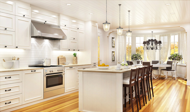
Kitchen Trends For 2019

Planning a small update or an entire renovation to your kitchen can be both exciting and sometimes overwhelming. With so many options in flooring, cabinetry, color schemes and the newest appliances, the choices can be endless. Plus, today’s kitchens need to be a blend of both functionality and technology, helping to make your day-to-day life a little bit easier. Here are just a few of our favorite trends in kitchens we are seeing for 2019.
Bespoke Storage
Storage that is 100% tailor-made and designed for the client is on the rise. Ceiling height cupboards and tall units with overhead cabinets with additional storage is trending. A wealth of storage solutions including appliance cupboards, pullout china stores, freestanding pieces such as dressers and multifunctional and hidden storage will be an essential feature for both compact and large kitchens in the coming year and bespoke storage is expected to rise.
Kitchen Islands
A kitchen island immediately conjures up ideas of both luxury and a sociable kitchen designed for entertaining. Not only is it a great place for friends and family to gather, it can also provide extra storage space, or a casual dining alternative when you add stools. A great alternative to an island is a peninsula. A peninsula works very well in single wall or L-shaped layouts. And look for waterfall worktops – a surface that appears to flow over the edge of the worktop covering the side and reaching the floor.
Bespoke Pantries
When redesigning your kitchen, a bespoke pantry is still one of the biggest trends this year and next. A must-have in the modern kitchen, with storage at the right temperature and ingredients easily accessible, a well designed bespoke pantry can also be a thing of great beauty.
Multifunctional Trough Sinks
Tough sinks are multi-functional and are gaining in popularity. With entertaining in the kitchen being one of its key functions, wine racks and wine coolers are now seen as must-haves. A relaxed modern country kitchen is a true marker of luxury and a trough sink used as Champagne cooler adds a perfect touch.
Specialty Water Taps
Premium water faucets will continue to grow in popularity this year. There are a multitude of finishes and styles to compliment every color palette. Faucets are now as important to the design as the work surface, cabinetry or materials used in a kitchen. Plus technology has stepped up when it comes to faucets with eco-friendly designs, water saving and touch less options, water filtration, sink and pot fillers and multifunction pull-down sprayheads.
The Smart Kitchen
The kitchen is the one room where you spend the most of you life so it must be the room that keeps you most up to date. Kitchen tech is endless and keeps evolving, but smart appliances, built-in Bluetooth speakers and automatic lighting will soon become necessities.
Single Slab Backsplash
Gone are the days when a backsplash was a very practical element in kitchen design. Under certain circumstances, designers are now using stunning single slab backsplashes as a real focal point in kitchens. Similar to how you would use wallpaper or paint or a piece of art to create a feature wall in your living room, a single slab backsplash can be used as opposed to standard tiling in the kitchen. Plus not only is it stunning to look at but it is also easier upkeep with less grout lines to keep clean.
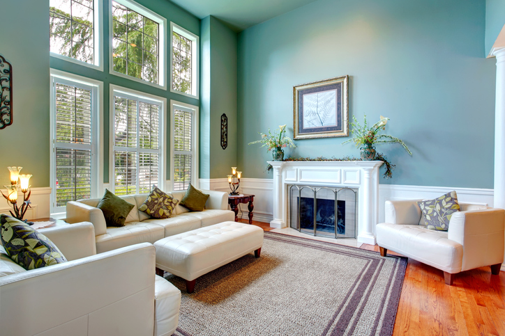
Earthy Colors In Interior Design
One of the most popular home design trends this year is the use of earth tone colors, as reported in Décor Magazine. In previous years, gray tones were often all the rage in interior design. This year, grey is still dominant but it’s often combined with softer pastels and earthy tones.
Earth tones describe a color palette inspired by the colors we find in nature. Warm browns, camel, greens, sienna, and umber, soft grays and tans all blend together to form a harmonious and welcoming interior in your home or office.
Earth tones work well in both modern and traditional homes due to their versatility and beauty and can add a layered look by building interest through various levels of tones and elements. This color palette tends to impress and is a safe choice for those looking for a relaxing and luxurious atmosphere that is both comfortable and pleasing to the eye.
November is a great time of year to enjoy a cozy space beside a fireplace with soft lighting in a well appointed home. Why not elevate your home interiors by calling Carole Lee today to schedule a consultation.
The Return of Wallpaper
Forget about blank walls, because one of the best interior design trends for 2018 is the use of mesmerizing wallpapers. Installing wallpaper is a great way to add an interesting twist to your dull living spaces.
With today’s tremendous options, the choice of designer wallpaper and the way it is used influences the overall decorative scheme in a big way. Some of the most popular wallpaper designs for 2018 feature landscape scenery, abstract shapes, and colorful geometric patterns. Below are a few things to know about using wallpaper to design your space:
It Dictates Style:Wallpaper can encourage a mood and offers a visual direction towards a particular style. A damask print denotes a traditional bedroom while a honeycomb pattern works for a contemporary dining room.
It Adds Drama: Designer wallpaper is a great way to enhance a room design with a bit of “ wow” factor, without the big investment of expensive art or lighting.
It Covers Doors Creatively: Get creative by using wallpaper on door panels or outdated sliding mirrored closet doors for a varied look. Cover them with removable adhesive wallpaper as a modern alternative.
It Acts As Art: Designer wallpaper itself can act as a work of art. Whether covering an entire wall or framed in pieces, this is a way to infuse a room design with decorative beauty.
To learn more about today’s wallpaper trends, contact Carole Lee at Carole Lee Interiors today!